It’s not all about who we are now. Unravelling genealogy, and getting a first hand account of where we come from and what our ancestors were like, is not only fascinating, but can also be extraordinarily revealing and helpful, giving posthumous insight, when it comes to understanding people’s characters, feelings and behaviours in different times. It’s so curious, the marks we leave behind, the little traces of ourselves.
I first came across Lord Tom Denning’s handwriting (1899-1999) a few years ago when a close friend of my father, knowing my passion for the science of graphology, presented me with a file full to the brim with cherished condolences letters from a hodgepodge of friends, relatives, the rich and the famous, following the sad and untimely passing of his beloved wife, Iris Freeman (Iris wrote ‘Lord Denning: A Life’ in 1994). David gave me access to this treasure trove of characters on paper, and my trained eagle eye immediately alighted on Lord Denning’s handwriting (produced at the age of 97, three years before he died, aged 100).
In spite of Lord Denning’s advanced years and deterioration in health – his scrawly handwriting was replete with all the wobbles and jerky movements you might expect in the script of a very elderly man – you could nevertheless still see his innate personality: the rich character and indomitable spirit, shining through. Lord Denning was the most celebrated, outstanding and controversial English Judge and ‘Master of the Rolls’ of the 20th century. He was known as the ‘people’s judge’ and as a ‘fearless champion of the rights of the common man’.
Lord Denning’s devotion to justice was rooted in his strong faith. His intelligence and quick, powerful, practical mind excelled in reducing issues to their essentials. His style, whether in his judgements or in his books, was always simple, clear, vigorous and direct. He was a puritan concerned only with what was fair and just, and his invincible (obstinate) spirit was evident. Lord Denning was undoubtedly controversial, since he was unafraid to speak his exceptional and unconventional mind, but he was also inspirational and influential in society. We shall see how his handwriting supports these opinions and roles.
This is the handwriting of Lord Denning, ‘the controversial people’s Judge’, age 97.
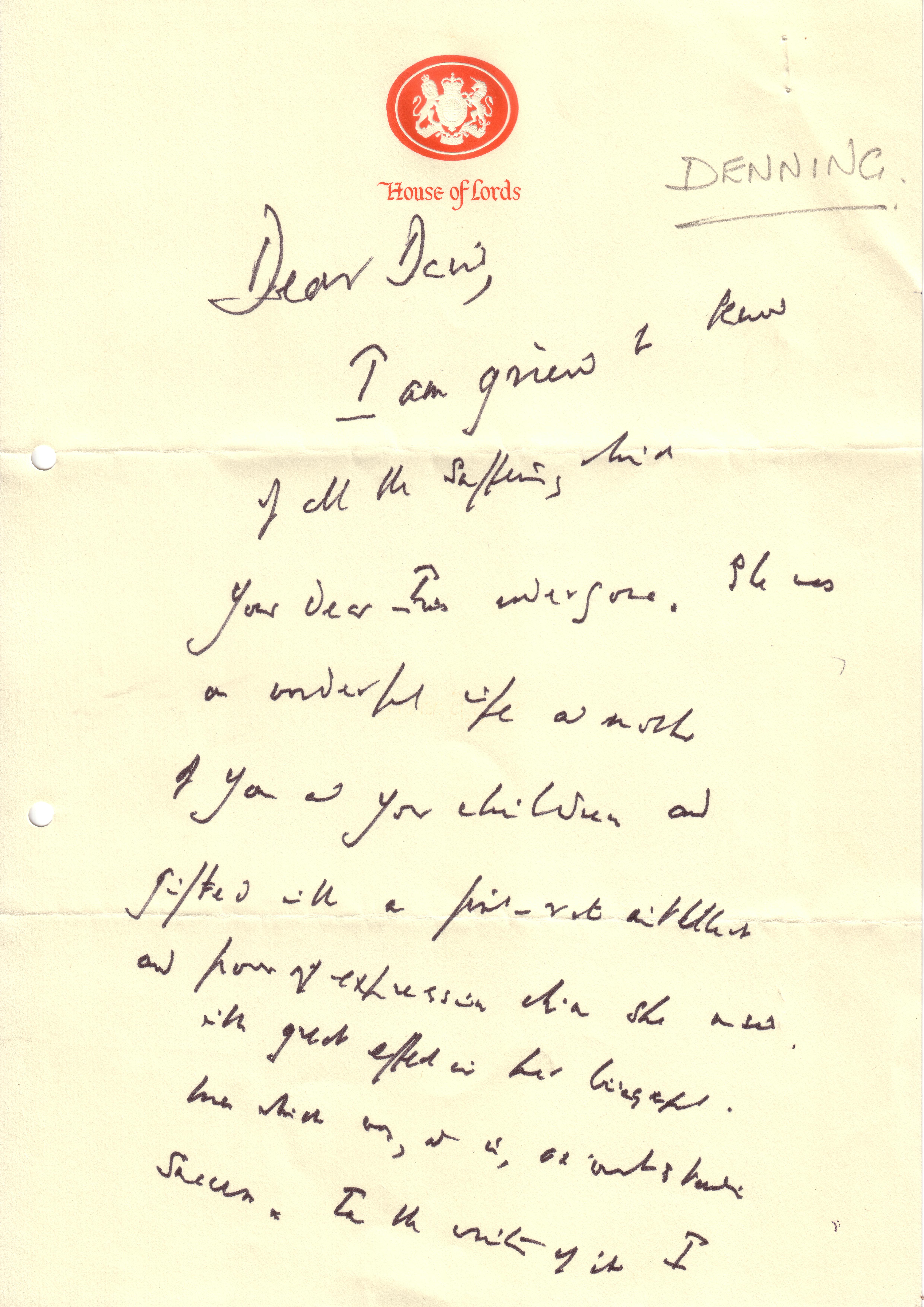
(original letter provided by kind permission)
Lord Denning’s huge intellect can be seen in the High Form Standard, which is the overall combined qualification of Originality, Layout and Speed, revealing the calibre of personality, and also the high level of intelligence at which he was operating and expressing himself. His sincerity is seen in his signature, which matches the text in size, shape and style. Not only is he genuine, but also the full stop at the end of his name is a warning that he will always want to have the last word, and is an implicit barrier to people taking liberties with his generosity. The final full stop says: “Don’t mess with me!”
Lord Denning’s writing slopes obliquely (the technical term for this is marked right slanting), telling of limitless courage and passion. He was ‘out there!’ restless and enthusiastic, rarely holding back, highly proactive, busy being compassionate, impulsive, emotional, and generally responding to everything PDQ. No wonder he was known as being ‘fearless’ as the ‘people’s judge!’ The large size of the writing reveals his ability to see the bigger picture; and the tall, spiky church spires of upper zonal stems tells more about his conscientious ways, his spiritual attitude, his ambitious desires, and his devotion to implementing his beliefs. He had very high standards, and strove to achieve things in life. The large lower zone long stems beneath the baseline also emphasise his practical motivation for other people. Denning’s inner critic can be seen in the sharp angular ticks at the end of his ‘y’ downstrokes). And some (but not all of the lower zone downstrokes) are also right tending (this is where the bottom of the stick or loop of the letter ‘y’ turns rightwards, instead of shooting to the left, which is the usual direction). This means that Lord Denning had altruistic tendencies and was community spirited. All his energies would have gone into the public sphere.
The style of the writing is simplified – copybook shapes are reduced down to the bare essentials – stripped back to their simplest, most elementary forms, like sticks and circles, to the extent that some letters are missing or malformed, making it quite difficult to read, virtually illegible in places, and forcing the reader to concentrate on the whole piece in order to make sense of individual letters and words. Simplification is where the writer has developed a more efficient way of composing individual letters, which speeds up the writing by taking shortcuts and eliminating unessential parts, usually whilst retaining legibility. Generally if there were any neglected strokes, then you would apply a slightly different interpretation. But here any neglect can be attributed to old age.
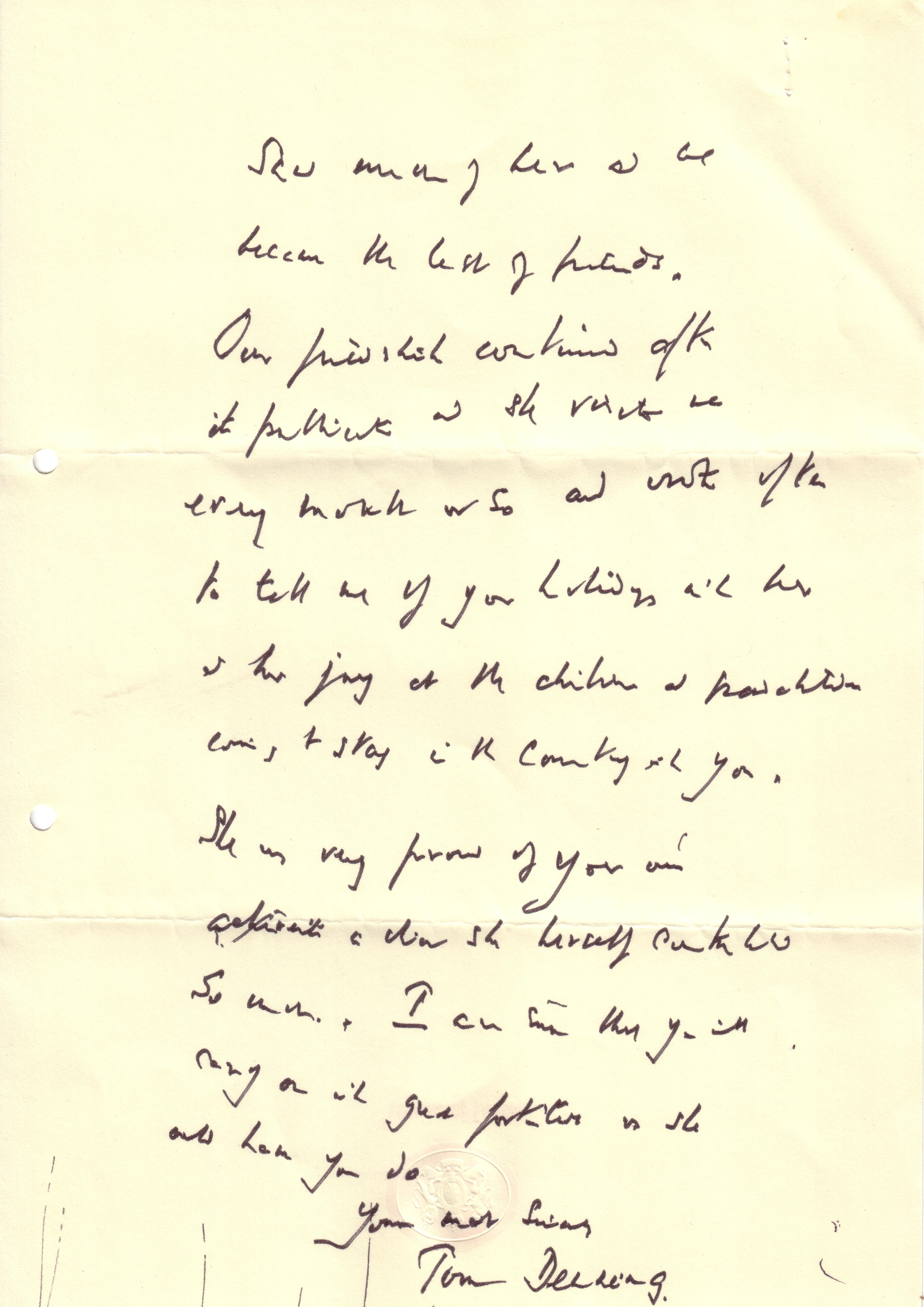
Simplified writing shows that the writer has matured by experience. The behaviour is natural and life is lived simply and purposefully. There’s clear judgment (backed up by the clear line spacing) with a sense of proportion, which means the writer is quick to get to the root of the problem swiftly and without wasting time on unnecessary details. These people are shrewd with uncluttered agile minds, and have the ability to decide quickly which issues are relevant and which aren’t. They are analytical and objective and have a clever way of making the best of things, arriving at a practical, workable solution. Basically, they dislike wasting time, and therefore apply an efficient, succinct and direct approach that cuts across any nonsense and gets straight to the point. Everyone knows where they stand with these writers. Sharp thrusting upstrokes (seen, for example, in the word ‘which’ – ‘w’ joined to ‘h’ – in line two on the first page of his letter) corroborate and ratify Denning’s keen mind.
There’s a mixed form of connection (the way individual letters are put together), which particularly features a combination of angles and thready letters (see, for example, the word ‘much’ on L1 of page 2 of the letter: the angles are in the sharp points of the ‘m’, and the thread is seen in the ‘h’ hump, which is flattened in appearance, like a piece of knitting that’s unravelling). Whenever you see this potent mix (of angle and thread FOC), there will be no questioning the writer’s intellect – he or she will be extraordinarily intelligent and sharp in their perceptions – so you know you are dealing with a very clever operator; someone who wants to do what they want to do; in their own way and their own style.
However, Lord Denning was selfless – it was never about him – he was interested in issues outside himself. He didn’t need or care about popularity for acceptance. We know this, because his middle zone letters are distinctly diminished in size – small compared with the other zones. The smattering of pot-lids supports this theory, (This is where the start of the downstrokes – above the letters ‘p’ construction – extend upwards, so that it appears to be sticking right up into the upper zone) telling us that the writer needs to get at all the facts through questions and answers, because he is determined to be right. These people can be quite contentious and argumentative. And where you see an angular connecting stroke, you know you are dealing with someone who can potentially be rebellious with other authority figures.
Further defiance can be seen in the lower case yet oversized letter ‘K’, which highlights how much people want to get their own way and follow their own path in life without interference. Lord Denning was resourceful, audacious and obstinate, and he certainly didn’t like being told what to do! His open ovals reveal his eloquence and determination to speak his mind, but the simplification and fast speed implies he wasn’t one for small talk.
The writing is also fairly connected throughout (with just occasional breaks), which is another feature of an articulate communicator – someone who is inclined to be quite opinionated, in their single-minded ambitious drive to be purposefully strategic. Cursive writers need constant stimulation. They think rapidly and logically, quickly grasping all the facts, linking concepts and ideas along the way, whilst calculating the potential risks at the same time. You could call this intellectual logic. Lord Denning was impatient to move forwards, persevering to the point of obsessiveness, and although he was always prepared to listen, once he was in full flow, he didn’t appreciate being interrupted!
Lord Denning’s big-hearted, open minded, non-judgmental, undiscriminating, generous spirit is seen in the broad width of the middle zone letters ‘n’ and ‘m’ particularly. i.e. The horizontal width of these letters is rectangular shaped and hence broad (draw a little imaginary box around these letters, and you will see what I mean). Broad primary width is the technical term used, and indicates people who are generally self-confident in all situations. They are people who express themselves naturally and frankly. Used in this context and we can also see that Lord Denning was not only a gentleman who spoke his mind and said what he thought in an influential way, but at the same time he was able to make certain concessions, because he was considerate towards other people.
The wide left margin is a display of formality – a sense of propriety and courtesy – as well as reflecting his unprejudiced nature. In fact the margins are wide on both sides as well as at the top of the page. Lord Denning knew he hadn’t got long for this world, and was becoming more and more withdrawn. Interestingly, the all-round wide margins in this particular sample (given enough other complementary handwriting movements, such as the large ascenders, broad primary width, angles, high Form Standard, some right tending lower zone) also bear testament to his philosophical mind, spiritual independence and conviction of his own value in this world.
The left tending letter ‘d’ (where it bends up, back and over to the left hand side of the page – in the opposite direction to the rest of the writing) means that he’s an intellectual moral freedom seeker. Lord Denning could be contemplative and reflective, and he needed time and space to think.
The writing is aerated. Here the words and sentences are all quite widely spaced, so the overall effect is one of pools of white paper (more than words) on the page. If you look closer still, you will see that the word spacing is variable – sometimes noticeably closer at the beginning of sentences – which tells us that Lord Denning made a conscious effort to be amongst people, although truth be told he was perfectly happy in his own company. Aerated writing reveals that ethics and truth are important to the writer. It is also a sign of the cultured mind. These people are clear thinking, interested in ideas and thoughts, and often creative and innovative. They are also experts in taking a broad detached view on things, and then making objective judgments. They are succinct in self-expression.
Reader, I make no apology for repeating myself in some of these interpretations: The point is, meanings are enhanced because they are seen repeatedly in different congruent (or compatible) handwriting movements (with similar interpretations).
Confidence, firm self esteem and positive self-image are all seen in the very large personal pronoun I’s, and the top convex ‘hat’ on his personal pronoun ‘I’ (as well as on the T bar hat in the capital letter of his name ‘Tom’) leaving us in no doubt that his strong willpower and personal self discipline made him unimpeachable – a force to be reckoned with. Wherever you see a convex hat on the top of a stem (which may be drawn slightly above the stem, so they don’t touch) you have before you a person with a tendency to curb unruly impulses in order to aim for betterment. It’s almost a spiritual sign – but always hopeful – revealing the overcoming of what the person considers bad in themselves, and the desire to replace it with good. Maggie Thatcher had a similar ‘T’ in her handwriting.
Lord Denning’s indomitable spirit can be seen in the baselines dramatically rising, until they can rise no more, and through pure exhaustion and perhaps some inner sadness they begin to fall just as dramatically, until he can find equilibrium and rally once again (on page two of his letter). Clearly he’s overcompensating at first, which shows he won’t be daunted – he’s putting a brave face on his age and deteriorating health. As a complete jigsaw, Lord Denning’s portrait is made of stern stirring stuff. Sadly no one is invincible, and old age caught up with him in the end.
This is a transcript of the handwriting:
Dear David,
I am grieved to know of all the suffering which your dear Iris undergone. She was a wonderful wife and mother of you and your children and gifted with a first-rate intellect and form of expression which she used with great effect in her biography……. success.
In the writing of it I saw much of her and we became the best of friends. Our friendship continued after it published (publication) and she rang me every month or so and wrote often to tell me of your holidays with her and her joy at the children and ….. coming to stay in the country with you.
She was very proud of you and ….. so much. I can …….
Yours most sincerely,
Tom Denning.
Note that the gaps are unknown words, due to fast speed of the writer’s handwriting, some deterioration due to age, and the overall illegibility.